Get Connected
They're one of the reasons for the web to exist, they're part of the net at a fundamental level and without them it would be a much harder place to visit. I'm talking, of course, about links. They're everywhere and are what makes the web work. Without them it's just a collection of pages that are hard to find and impossible to 'surf'. Links are one of the most powerful and useful features in the online environment, and one of the simplest. We all include them on our websites, but do we think about the usability of links? You, the page author, may know something is a link, but how do you convey that others?
Most site builders are well aware of the need to make links standout. This need is obvious when you look at the paragraph below. There's no way to tell if there is a link in it, let alone where it is.
I hadn't heard him right. Couldn't have. The idea allowed me to find my voice again, at least. 'Did you say it went for forty thousand dollars?'
'Four hundred thousand dollars,' he said. 'Under the rules of the road' -- meaning the contract I'd signed -- 'two hundred K of it's yours. Congratulations, Steve.'
I was still standing in the doorway, looking across the living room toward our bedroom and the crib where Joe slept. Our place on Sanford Street rented for ninety dollars a month and this man I'd only met once face to face was telling me I'd just won the lottery. The strength ran out of my legs. I didn't fall exactly, but I kind of whooshed down to a sitting position there in the doorway.
The only way someone could discover it is if they put their mouse over it and the cursor changed, the chances of which are very slim.
It's obvious that links should standout in order to make it easier for anyone to spot them. Web users have, after all, been trained to expect links of a different colour or style to the main text. Getting the right combination can have a massive impact on the usability of your site. As I mentioned, colour, style and text decoration are all commonly used ways to distinguish link text from plain text. Generally, style and text decoration are best used in conjunction with colour to help make them stand out. Take a look at a few examples: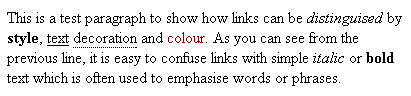
As you can see, using text decoration or style alone, while far better than nothing, is still highly confusing. Italic, bold and underlined text is commonly used on sites to emphasise specific words or passages, which means links could easily be mistaken for such. The best way then, is to use colour to distinguish your links from the main text. This can be used exclusively, but is usually most effective when combined with text styles or decoration.
The default colour for links, if left unchanged, is usually blue. This may not suit your site, and as it's the default, many people would change it just for the hell of it anyhow, so you may need to find another colour to use. Whatever the colour, it needs to be significantly different from your default text so as to stand out. Picking an antagonistic (check) colour might be an idea, or simply picking another colour from your scheme.
As I mentioned, colour is probably the best distinguisher if you are only going to use one method, but changing the style, by making the text bold or italic, or using text decoration such as underlines, borders, images or background colours can help make links highly visible.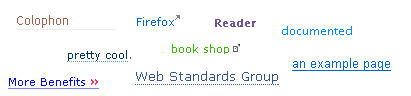
Underlines are still sort of expected by end users, and many sites still use them to signify links, but large numbers of designers don't want to use them for aesthetic reasons (or perhaps because they want to step away from the norm and be different and distinctive). For that reason some sites have dropped or replaced underlines with alternative techniques such as borders and images: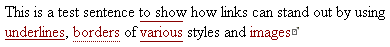
These are just another way of providing a visual clue that the text is a link. Some designers have even used background colours to help distinguish links: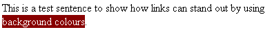
Personally, I wouldn't recommend this method as it reduces readability and can be an overpowering draw of the eye.
Making a link stand out in ordinary text is simple enough then, and obviously doing so increases the usability of your site, but let's not forget the other link states: hover and visited. I'm sure more people are aware of the hover state of links, made notorious by Javascript rollovers if nothing else. The hover state is called into effect when you place your cursor over a link. On every computer system I can think of there is a change in the cursor state to indicate something is a link anyway (i.e. it changes from an arrow to a hand), but you can also specify what happens to your text as well. This is useful for three reasons: it provides a second visual confirmation that the text is a link, it confirms which link the user is about to select and it helps highlight the size/shape/length of a specific link. This last point is useful if you have a sentence where you have several words that are linked to different places. If the user highlights one, which changes state, but the others do not, it instantly alerts them to the fact that there is more than one link (see example).
Most site's tend to use a lighter or darker variation of their link colour for the hover state but again, the options are limitless. Obviously this can be done using the any of the other suggested link identifiers: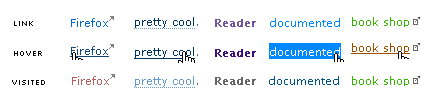
That leaves the visited link state. This is often overlooked as unnecessary with many site builders happy that links are highlighted and they look flashy because they change colour when hovered over. This neglects the usefulness of the visited state in identifying which links a user has already visited, thereby increasing your site's usability. Take the example below: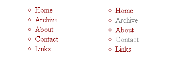
The example above demonstrates the difference between having a different hover state and not. It is easy to see which links have been followed in the right-hand example, it's impossible to tell in the example on the left. This effect is magnified by the number of links you have, and is more important if you have large lists of links (like a blogroll for example). Without the visited state, your users will have no idea which sites/pages they've visited and those they haven't, which results in confusion.
Fitt's law basically states that the usability of a link is proportional to its size. Put simply, the larger the link area, the easier it is to use. This is common sense when you think about it and has been discussed at length by both Dave Shea and Dunstan Orchard who covered far more points than I will. As I said, making a link larger makes it easier to use because it needs less accuracy to hit it (Fitt's law also covers the location of the links but I won't go into that here), and in the case of something like navigation links it also means that the user can click the link while looking at the label, ensuring they are clicking the correct one. This is of little use to the user, especially a new visitor to your site, if you don't indicate what the clickable area is, so make sure you indicate where a user can click to activate the link.
Then of course, there is the text you use in a link. A huge number of sites settle for using 'click here' more often than not, sometimes with a description before, usually not. It's much better to use a description of where the link is going as the link rather than a simple, easily confused, ambiguous statement.
Not only do the links become more useful, especially out of context, but you also increase the clickable area and, by making it larger, you can draw more attention to it.
Links are fundamental to the web and the operation of every site. They're simple to get right, but going that extra mile for your users can make a big difference. Some web designers seem to be unaware of how links are used and how they should help the user in the navigation around of their site.
Many others have written at greater length and in more detail about many of the things I have listed above, but I have used all of these techniques and know they work well. This article isn't designed as the definitive guide, but hopefully it will open your eyes and point a few people in the right direction.