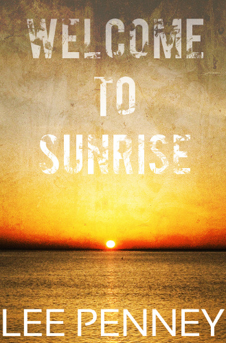
There are a number of things you need to do to self-publish a story. Writing it is the most obvious, but if you want to sell it then you’re going to need a cover and the importance of a good one should not be underestimated.
I’ve seen plenty of stories of authors claiming a new cover kick-started sales on their book. I’ve also come across plenty of amateurish covers, and what does that say about your book? It can imply the contents may not be up to snuff.
You can pay someone to produce your cover, with prices starting at a few bucks (check out Fiverr), pre-made ones for tens of dollars, all the way through to hundreds or more for a bespoke design from a professional. If you’ve got a story that’s likely to sell well then any cost will be paid back, given enough time, and if it increases sales it may be worth the investment.
I was churning out short stories, and one of my goals was to not spend any money producing my ebooks, not until they began to earn enough to cover them at least. So that meant designing my own covers. I’m not a complete novice, I know my way around graphics software, but I’m a long way short of a graphic designer. More an enthusiastic amateur.
The good news is there are tons of tutorials on the internet to help you out, and I’ll try to provide a few pointers here to make your learning curve a little shallower.
TL;DR
Here’s the summary for those who have an attention span too short to get through this piece (which is far longer than I intended, as much of my writing ends up):
- Get yourself some (free) graphics software, something with layer and undo support
- Find some design inspiration to guide you, whether it’s a cover in the same genre or an advert in a magazine
- Find ONE image to represent your story and make it the centre piece, it needs to be large enough for a cover
- Use an appropriate colour scheme (e.g. pink for romance)
- Browse the free font libraries for a suitable design, be aware of their connotations
- Use a maximum of TWO fonts, one for the title and one for your name
Software
To start, you’re going to need something to produce your work of art in. There are plenty of free and paid-for packages. The cream of the crop is Adobe’s Photoshop, but it’s very expensive, so probably not for those on a budget (and probably overkill anyway).
I’ve heard of people using PowerPoint (no!) and Keynote to design in, and there are the likes of Inkscape, Seashore, Acorn and Pixelmator. Personally, I use GIMP (GNU Image Manipulation Program), which is free and offers a ton of features.
Find something that works for you, but definitely something with layer support, undo history and plenty of ability to tweak endlessly.
Design Inspiration
You may find this hard to believe, but I’m not a graphic designer. I do, however, subscribe to Picasso’s maxim of: ‘good artists copy, great artists steal.’ (Often credited to him at least, it’s not important who said it.) In this instance, I mean find a cover or some other work that you like, ideally something in the same genre, and use it as inspiration.
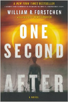
You shouldn’t just outright rip it off, but stealing certain elements is fine, or the overall aesthetic. As I said, it doesn’t need to be a book cover, it could be a poster, an advert, the packaging of your favourite cereal, literally anything.
For example, I stumbled across the cover for William R. Forstchen’s One Second After, which matched what I was trying to create for Welcome to Sunrise. I had been trying to find a picture of a lake that had the right level of desolation, to indicate the crumbling of society, but couldn’t, so took this as inspiration and modified what I could find using a few tutorials (we all use them, so don’t be worried about reading some).
Finding an Image
I’m all for sticking with simple: find one image that encapsulates your story, maybe an object from it, maybe something that highlights a theme, and use just that.
Depending on your level of skill, you may be good at blending images together, but it’s something that’s very easy to get wrong and it can look amateurish. While I’m all for layering up, less is more in this case.
So where do you find a suitable image? You can take your own photos of course, but I usually turn to the multitude of free images available online. We’re looking for those with a licence to re-use commercially. Google’s advanced search can do that, but the best places I’ve found are: Flickr and stock.xchng. You can limit by the licence type on Flickr’s advanced search page and I think all the images on stock.xchng are free to use (check the licence on the image’s page).
Obviously you need to credit whichever one you use, put their name/details on your copyright page.
Various government agencies also provide public domain images, such as NASA (for space photos) and various defence departments (for planes and ships).
Yes, you can go to the various stock photo sites and pay, you may get better quality, but at a cost, and if you read the fine print, for a limited number of copies and/or time too.
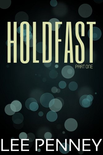
What do you do if you can’t find an image that works? Have a search for a tutorial on making something or go abstract. If your story takes place on an alien planet, there are plenty of tutorials on turning a photo of the Earth or the Moon into an exotic vista, for example.
For the cover of Holdfast, I searched for images, not really knowing what to use to represent a world so different to our own, so I decided to go abstract.
Size is also important, you need something at least 1,000 pixels tall, as that’s the minimum size you need for a cover, ideally you want bigger. It doesn’t matter if it’s perfect, if it’s too small, move on.
Colour
This is an area with a huge amount to learn if you want to know it all, not just about contrasting and complimentary colours, but also the psychology: red is the colour of passion, but also of warning; yellow is energetic and cheery, reminding us of summer, etc. Go Google it if you want to read up on it all.
Finding some design inspiration will probably help a lot with this, and much of it comes naturally to most people. For example, in my covers, you can see several of them are devoid of colour. That was by choice. They’re post-apocalyptic tales and making them monochrome makes them feel sullen and depressing.
Another place to find colour schemes are sites such as COLOURLovers and ColorSchemer, where you can find whole palettes picked out for you.
The palette used on the Holdfast cover is all about representing the deep ocean, hence sticking with blue-greens.
Fonts
There are plenty of free, high quality fonts out there. Just type ‘free fonts’ into your favourite search engine and you’ll find an overwhelming number of entries. Personally, I usually browse over at Font Squirrel, largely because it looks good and is easy to navigate.
The problem in most cases won’t be finding a font you like/that works, it’ll be narrowing it down to one.
Again, if you’re not graphically-minded, look for some design inspiration and use that to guide you. Try a few different variations and see what works (it doesn’t cost you anything but time).
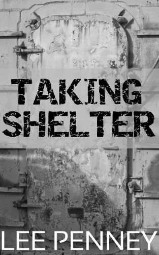
Typography is a complex subject, and I love fonts. There are thousands, if not millions, around and they surround us every day, largely going unnoticed. When you stare at one you’ll probably find it strikes a cord in some way. Some we associate with the past, some with the future, some with horror, others with romance or comedy. When you try a few, listen to those instincts and only pick ones that match your genre.
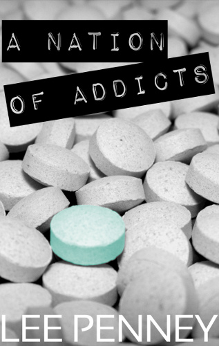
The right font doesn’t just convey the words, it can also help carry meaning and it’s part of the design. Looking at my cover for Taking Shelter, you can see that I went with a distressed font to help suggest the crumbling, post-apocalyptic state of the world. While on A Nation of Addicts I went for a font resembling a label, something that might appear on a test-tube or medication bottle.
While we’re on the subject, less if more. I’d recommend sticking to two fonts: one for the title and one for your name.
Final Thoughts
If you follow my advice, does it guarantee a great cover? No. Will it generate you more sales? Maybe. Is it foolproof? No. But it should help you avoid ending up with a dodgy cover, something that may put off potential readers.
I am by no means an expert on this, but hopefully I’ve shown that with a little thought, a little work, and some basic ideas/rules you can produce a respectable cover to go with your work.
I don’t wish to belittle what cover designers do, a good cover is worth some effort, and when finances allow I’d suggest seeing what’s on offer (it doesn’t have to be expensive), but if you’re a control freak like me, or on a non-existent budget, the DIY approach doesn’t have to be overwhelming.
